Monopoly Go!
Since the Monopoly Go! project I worked on before leaving Scopely to focus on High Gloss Designs (my company) full time, the game had gone through a complete rewrite including a genre shift (from mid-core PvP to ultra casual currency accumulator). The GM of Monopoly Go, reached out to me because he and other leaders on the team felt the UX & UI were falling far below their target for launch. They brought me back in to get the UX team back on track and ready for launch. The game has since become the highest grossing mobile game in the world.
2 Key Goals of the 3 month UX Revamp:
Revamp the UX to fit the game and brand with new UX/UI visual targets and a complete UI/UX style and strategies guide for the team to reference for the remainder of development.
Restructure the design team and production process to create repeatable success after my exit as Interim Team Lead.
Below is a small sample of the work done by myself and the Monopoly Go! team during my time as the consultant Product Design Lead.
Tools:
Unity, Figma, Photoshop, Illustrator, Unity, JIRA, SourceTree
Platforms:
Android, iOS
Checkout It Out!


Main Goals for the Visual Revamp of Monopoly GO
Bring Clarity to Gameplay Through the UX
Let the Nostalgic Monopoly Brand Shine
Bring Clarity to Gameplay Through the UX
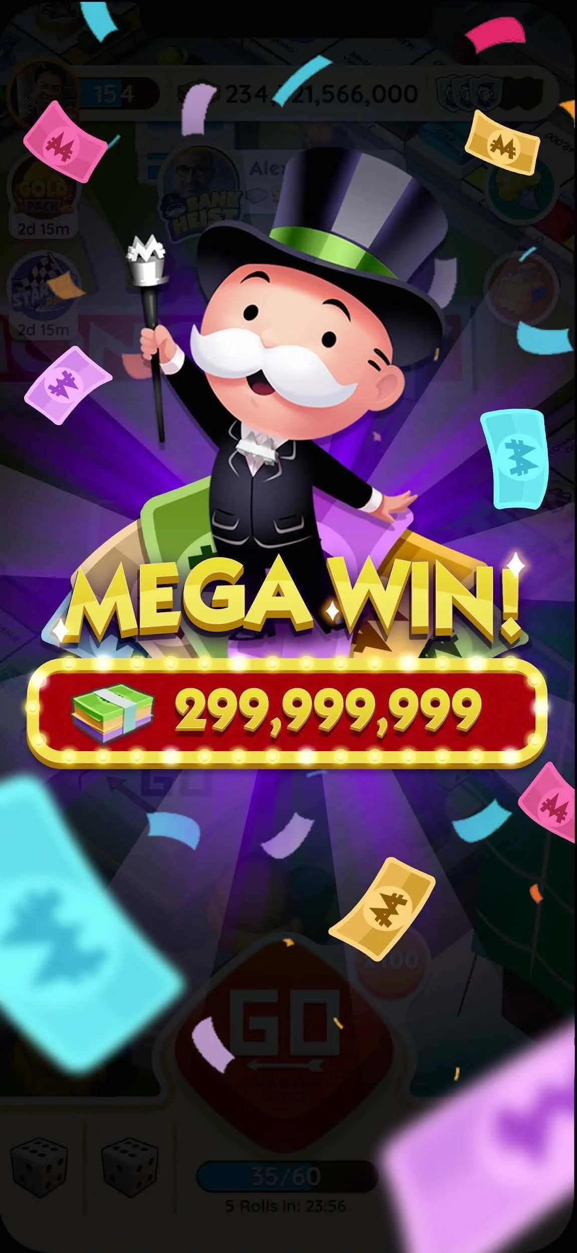
Situation: Monopoly Go! is a game of constant win moments, charming character art, and beautifully executed 3d and 2d animations. This delightful game elements were blending into the UI and everything from important player actions to big win moments felt like a monotonous click through. What makes for good UX in UI design is when you can craft the right moments to call attention to your UI elements but otherwise be a good canvas for the other areas of the game to shine.
Task: Clarify what was happening by visually separating the Game World, UX and VFX win moments.
Actions:
Assign saturation standard to various the UX layers based on level of importance to create clarity in player actions and gameplay. Save the splashiest visuals for the biggest moments!
Create easier to read systems and standard for persistent UX elements (buttons, currencies, etc.), drawing attention to the most important player actions that drive player delight.
Results: A repeatable visual system that drives important player action, increasing player enjoyment and thus retention downstream.
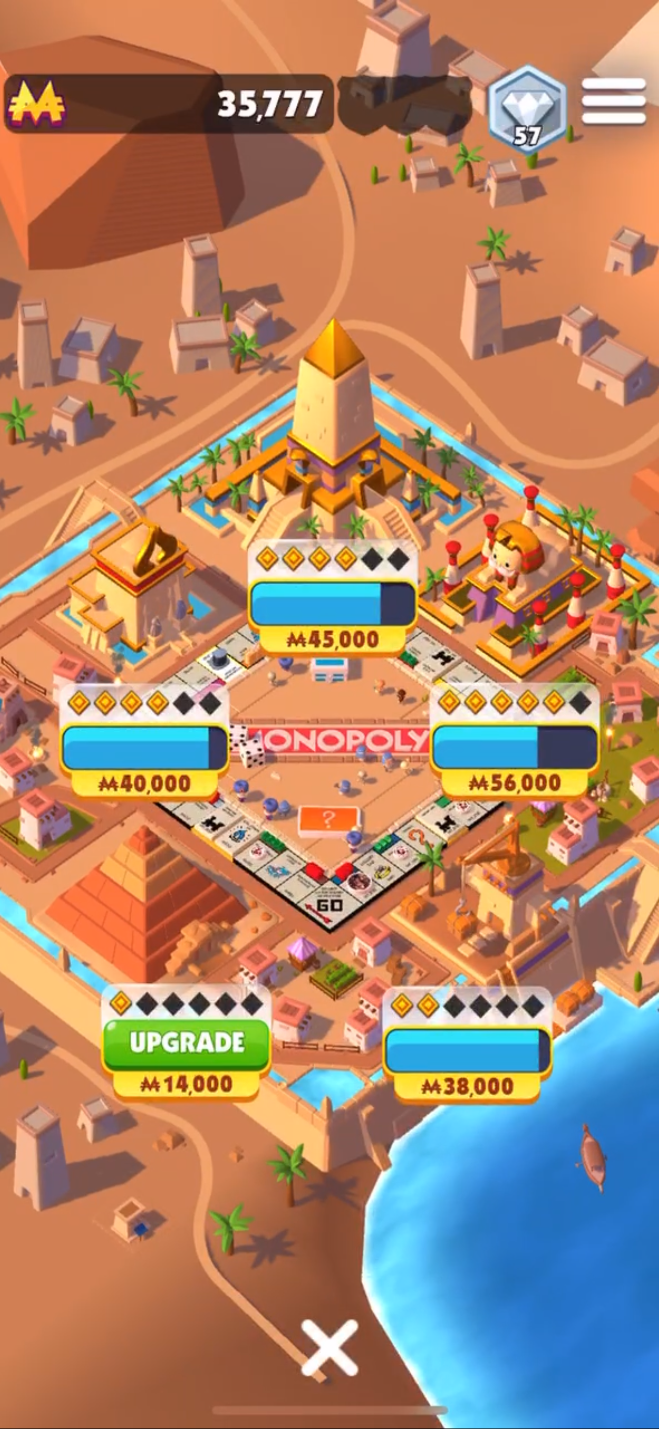
Home Screen
Before
After
Simple edits to the home screen elevate the important UI elements that drive gameplay and player enjoyment
(Also an example of the effort to integrate small nods to the board game feel, for example rotating the “Go” button to match the orientation a player would see on the original game board)
An example is how we more dramatically elevated the biggest moments in the game to make them feel truly special and rewarding for our players, incentivizing them to continue playing to seek these moments again and again.
Distinguishing Gameplay / UI / VFX
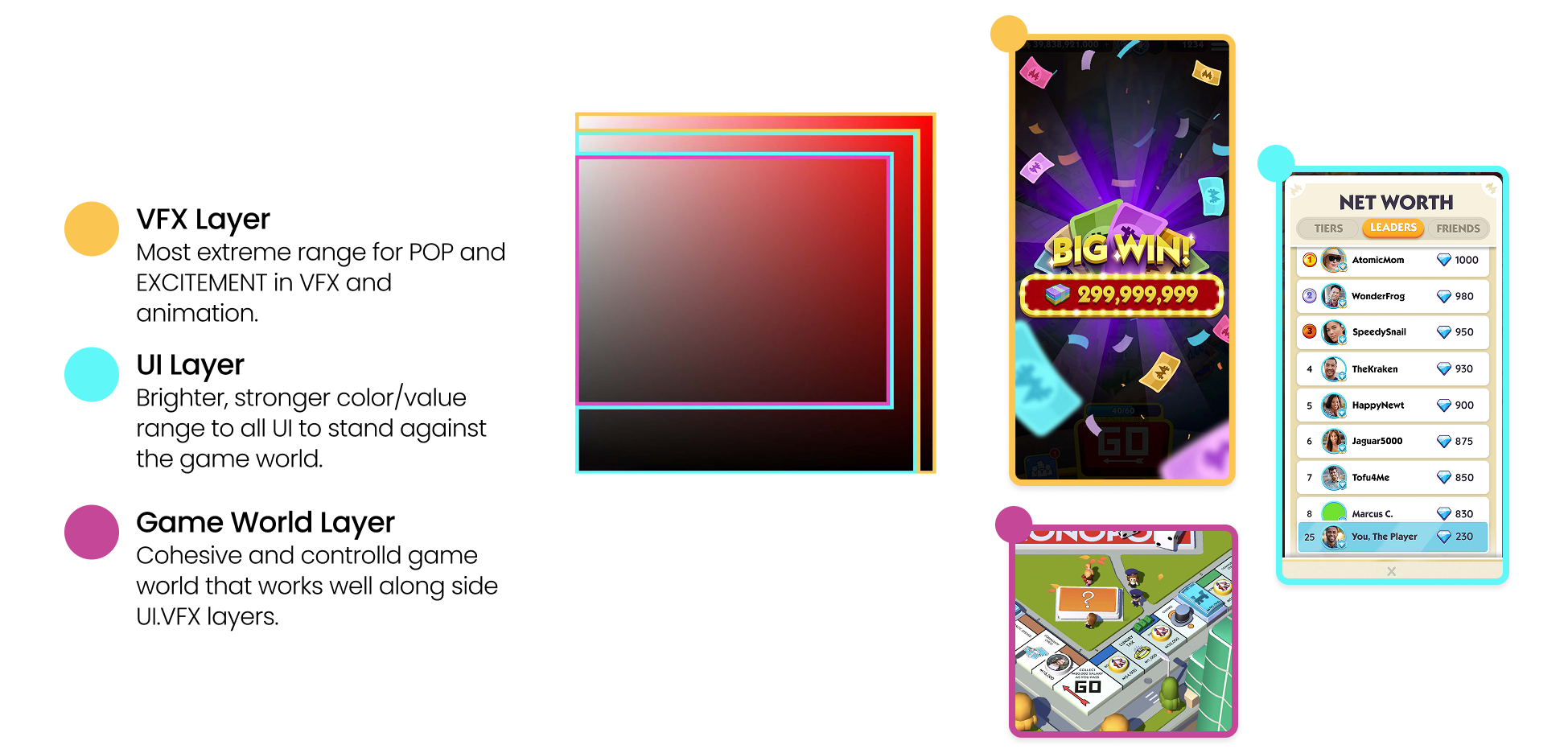
The overarching design strategy to clarify the importance of the game world was to create a system of color tone and saturation to interplay with the base gameplay layer, the UI overlay layer the VFX layer.
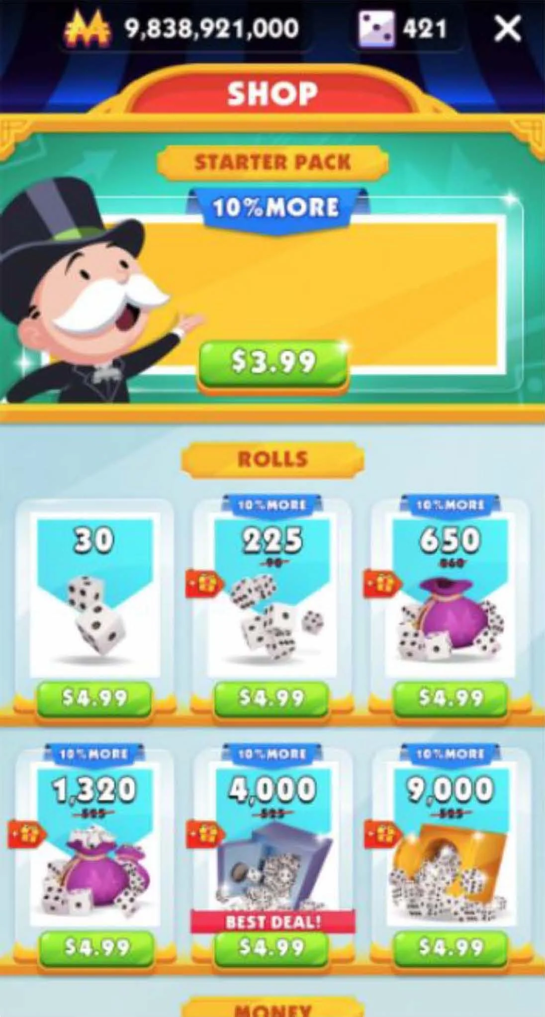
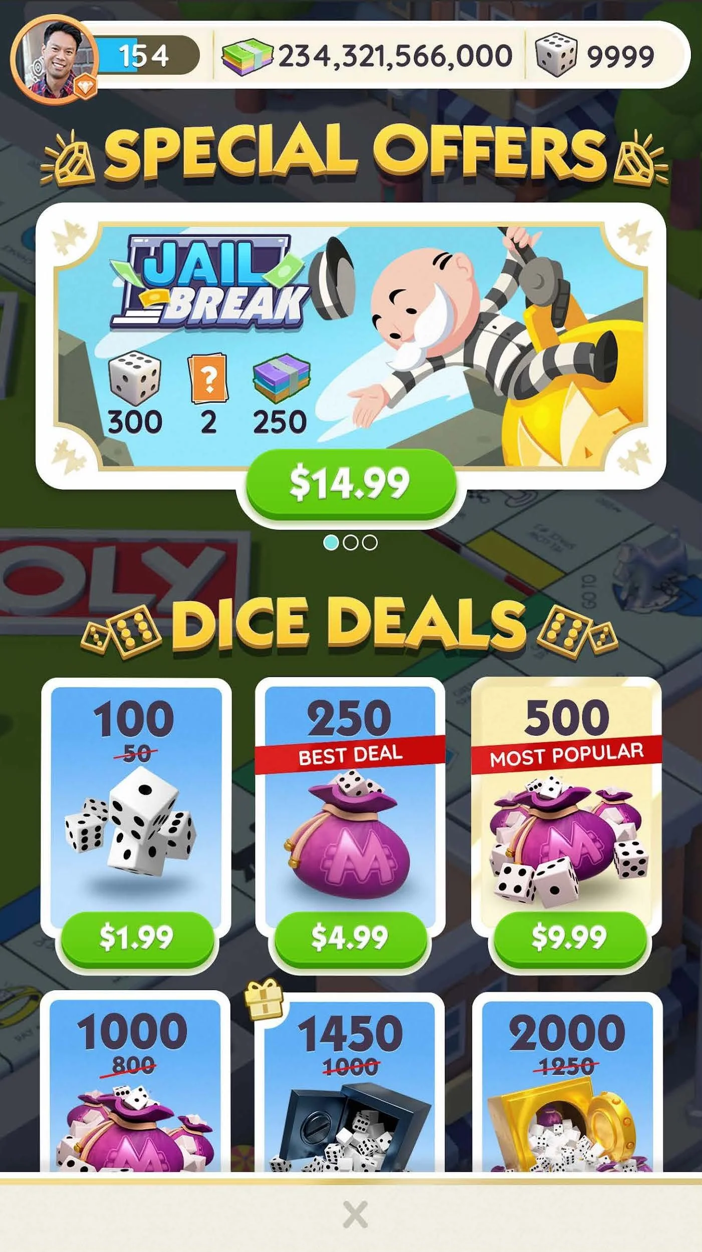
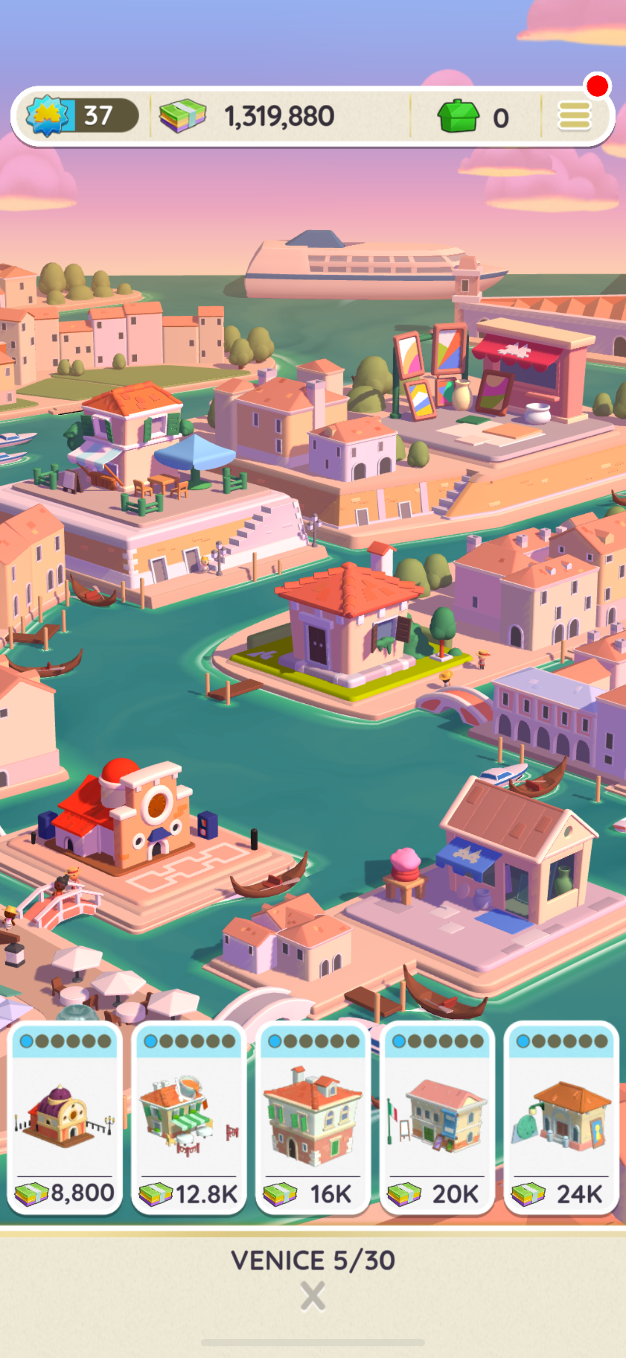
The Shop
VFX

Inventory
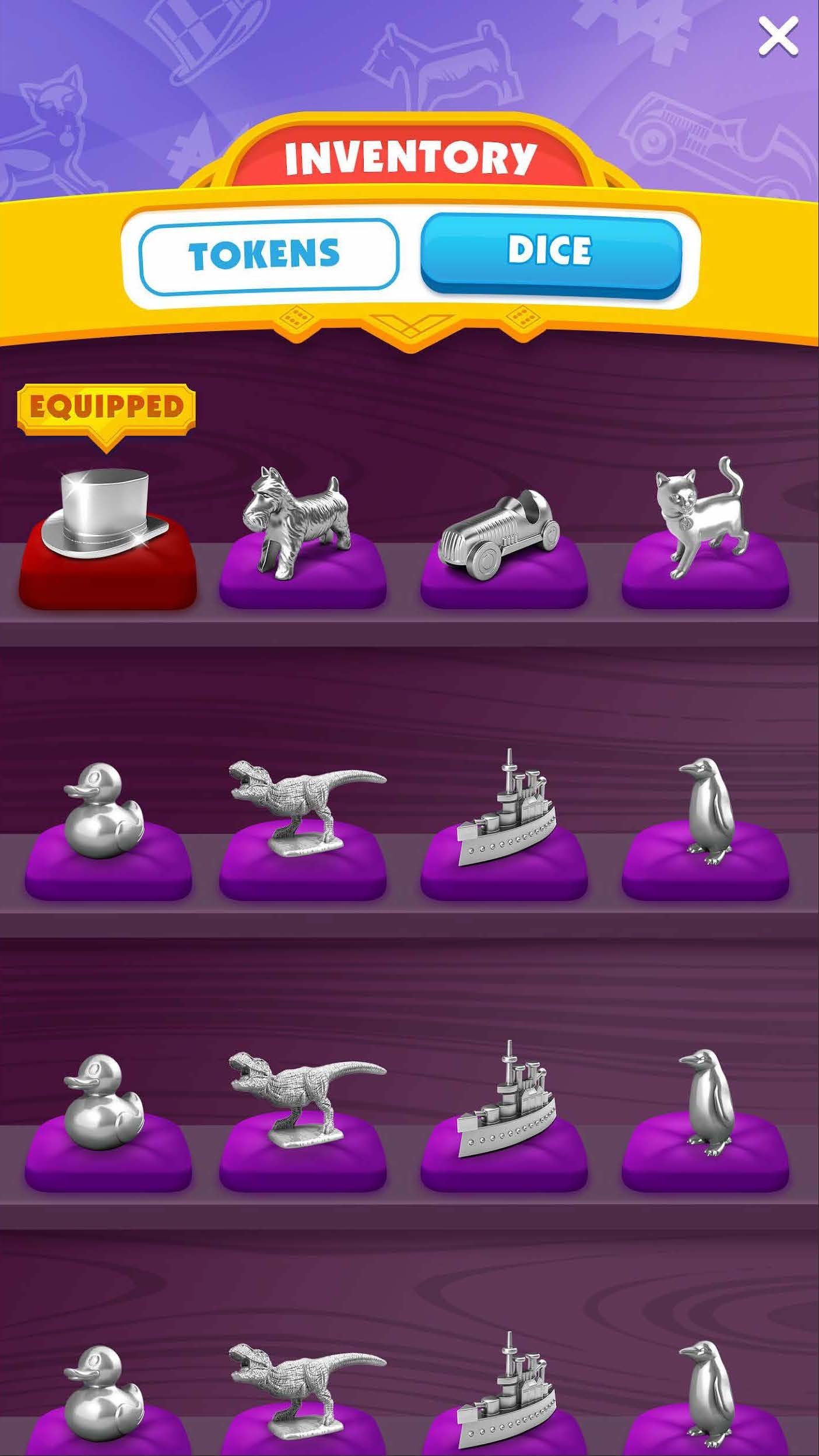
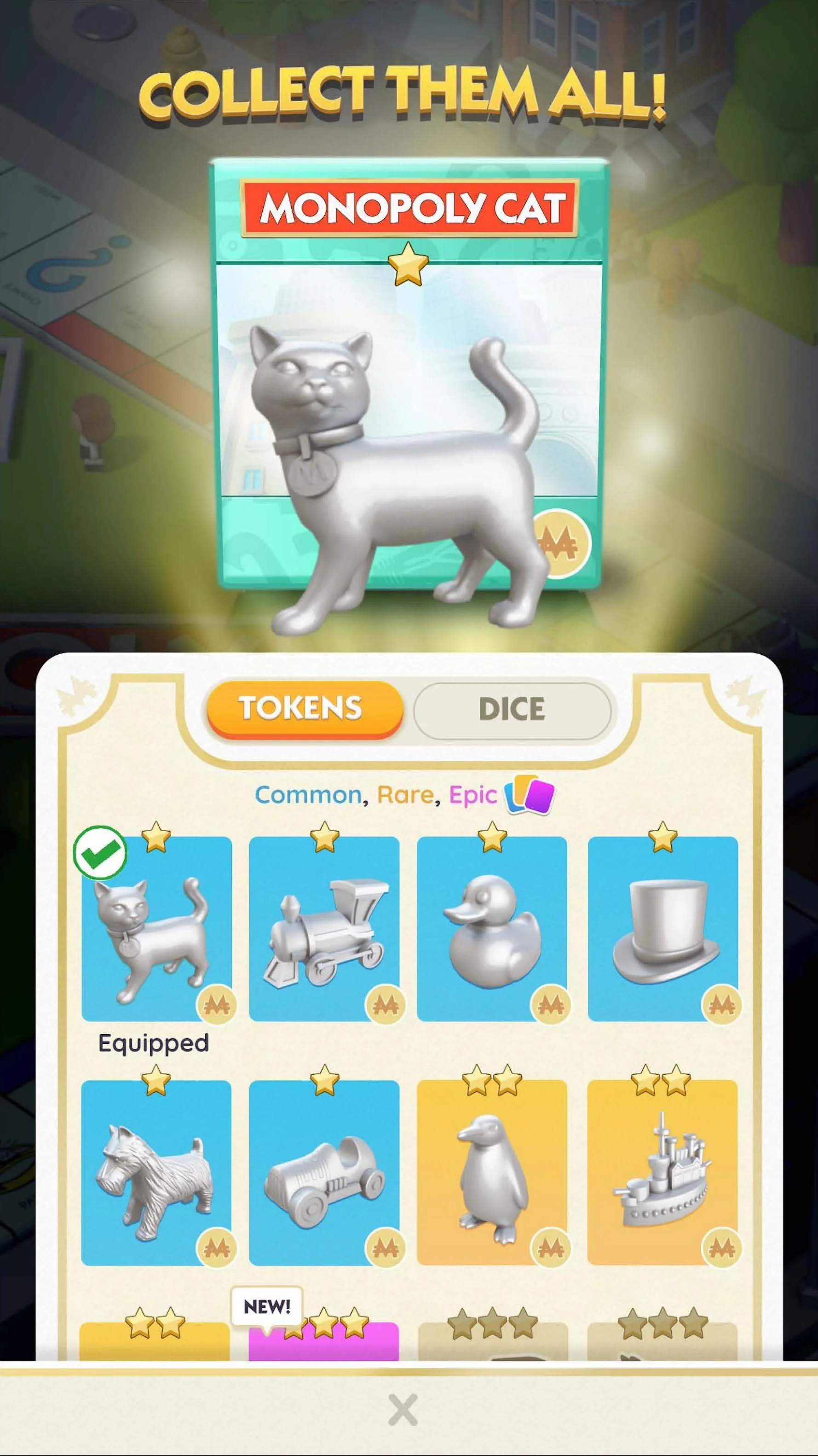
Each of these 3 screens shows how layering can create contextual moments. By not completely blocking the game board, the player still feels like they are playing, allowing them to quickly make a selection and get back to core gameplay without losing context. (Also examples of the nostalgic game board feel outlined in goal two explanation below)
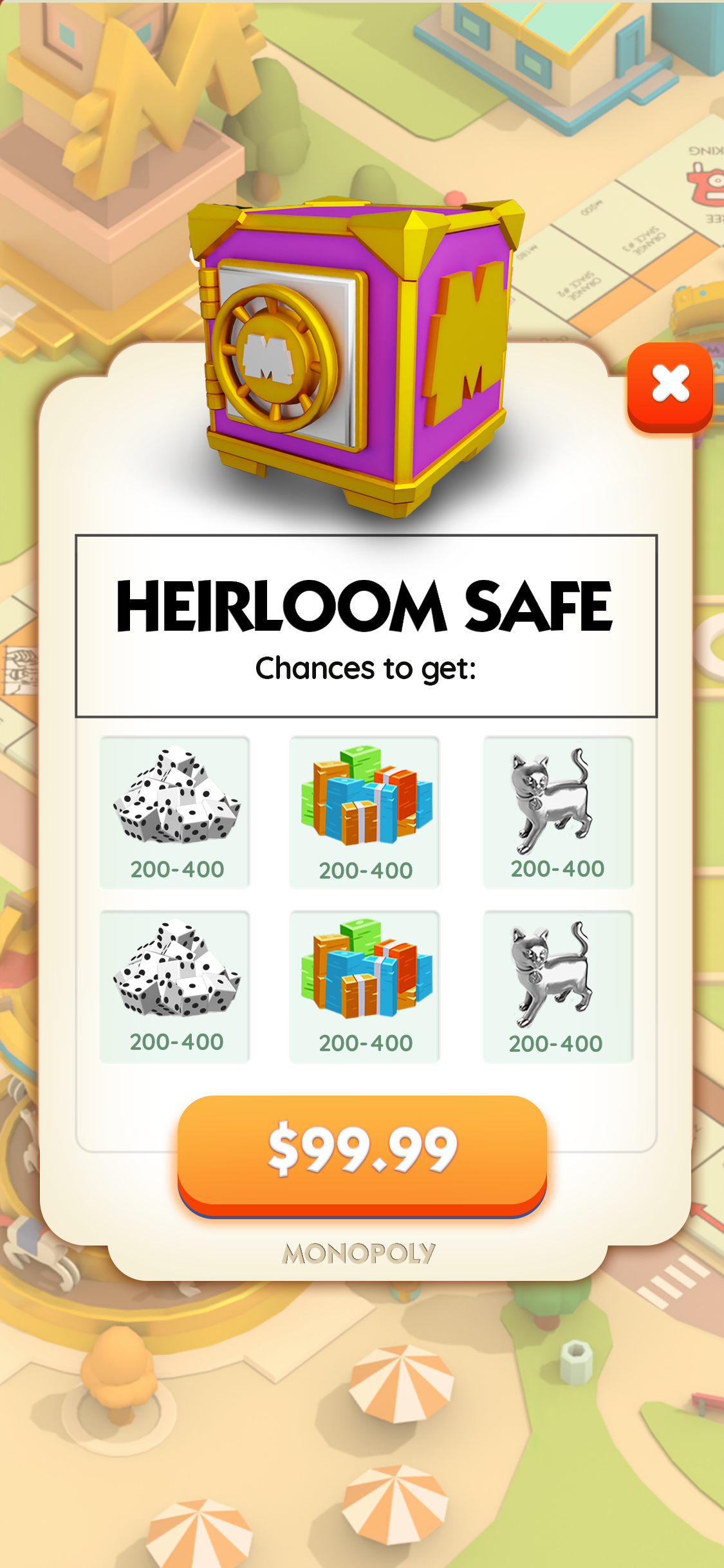
Before
After
Before
Before
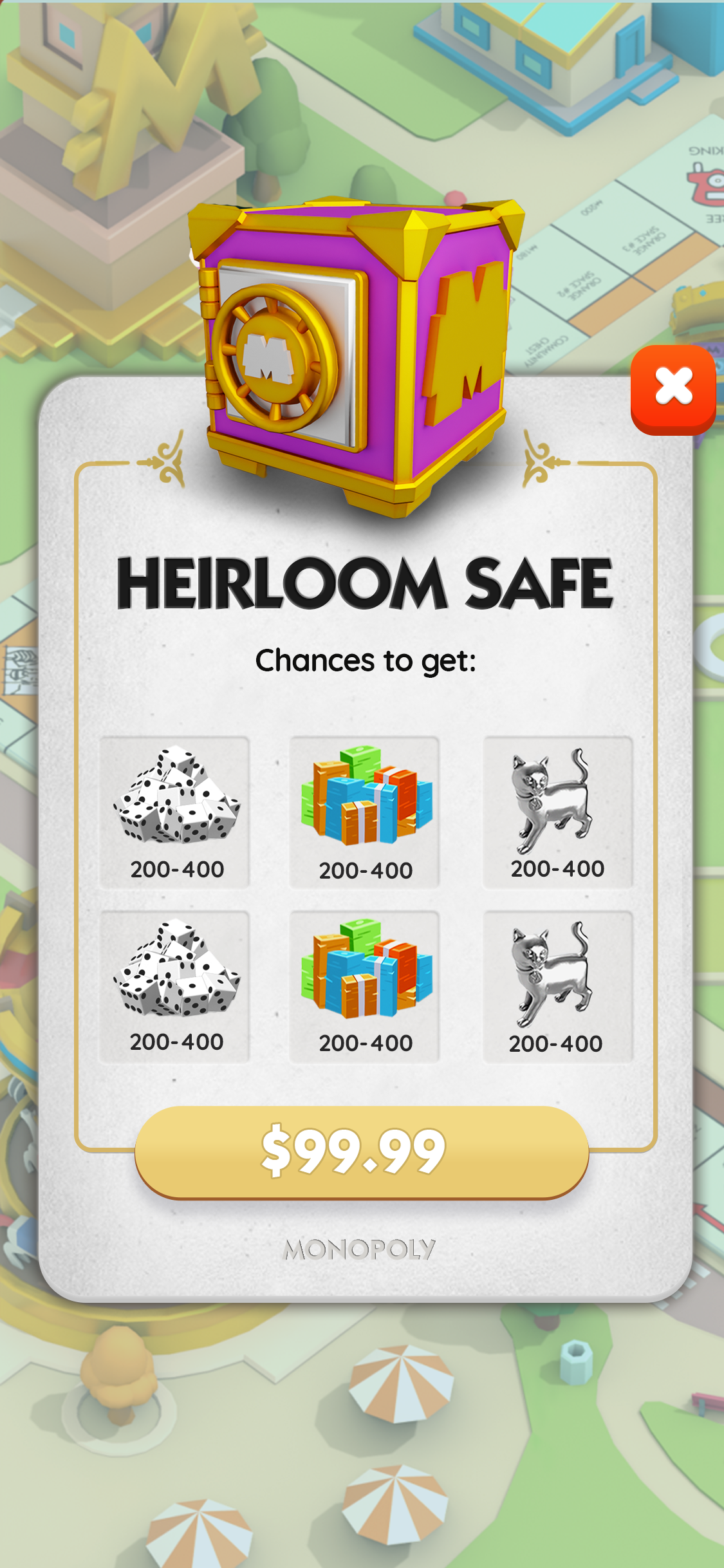
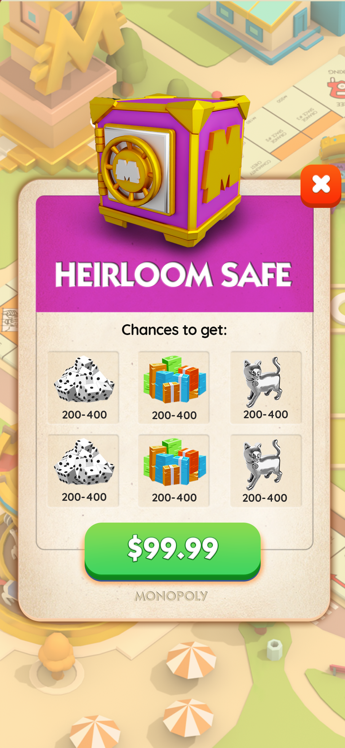
After
After
Before
Property Upgrade
After
Let the Nostalgic Monopoly Brand Shine
Situation: Monopoly is a game that almost everyone has played or is familiar with, and as a designer, it’s always an incredible opportunity to work with brands that have brand power like Monopoly. The game felt flat and failed to leverage it’s #1 strength in its UI - the nostalgic power of the Monopoly brand!
Task: Make the game feel like you were playing a reimagined original.
Actions:
The biggest example is bringing in the game card feel to the UI pop ups to give the gameplay much needed continuity
Keeping context by keeping the board game in site to always feel like you are playing a board game and simply elevating UI overlays with blurring and saturation.
Results: A modern mobile game with a nostalgic feel landing perfectly a reimagined classic.
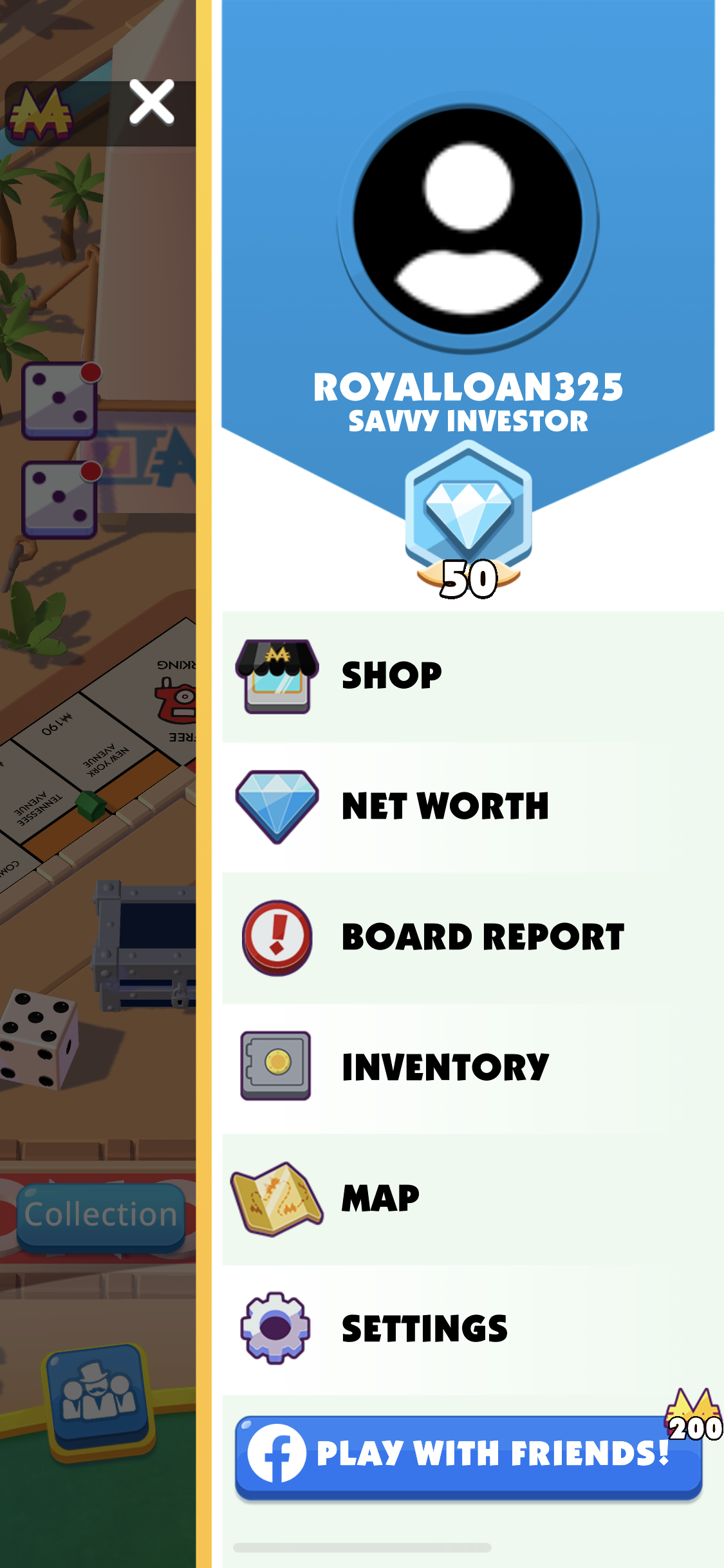
Hamburger Menu
Before
After
Before
After
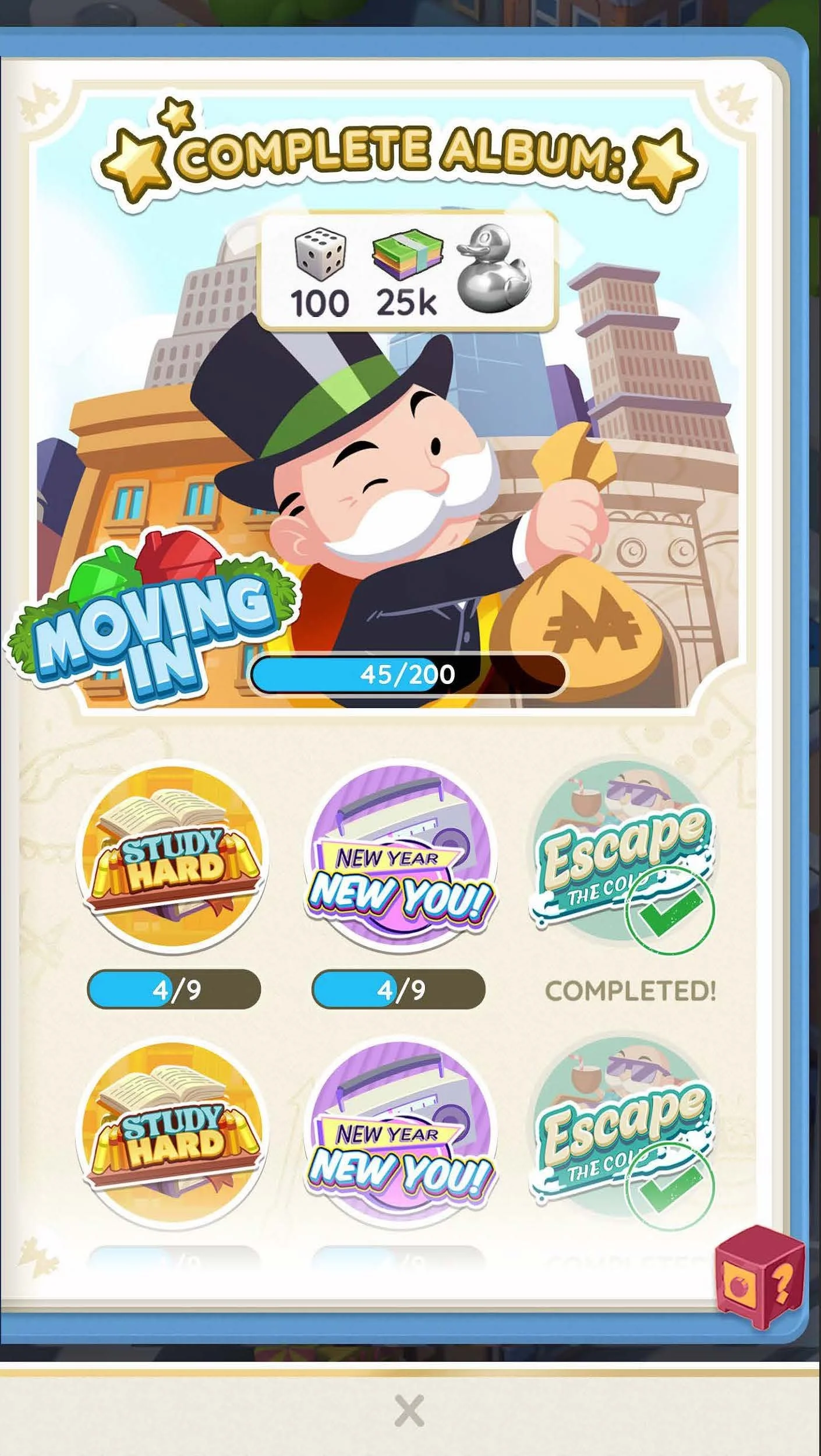
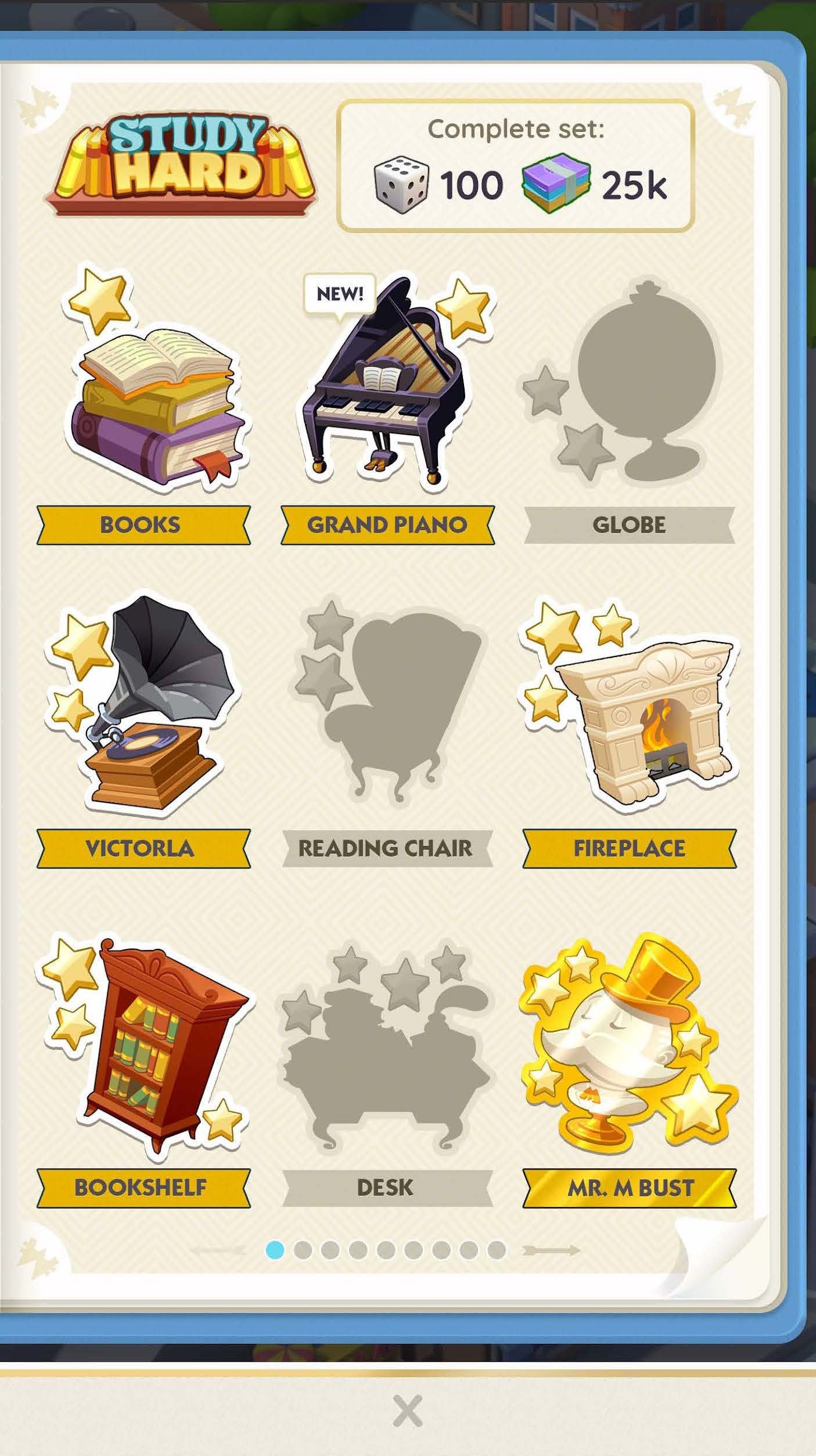
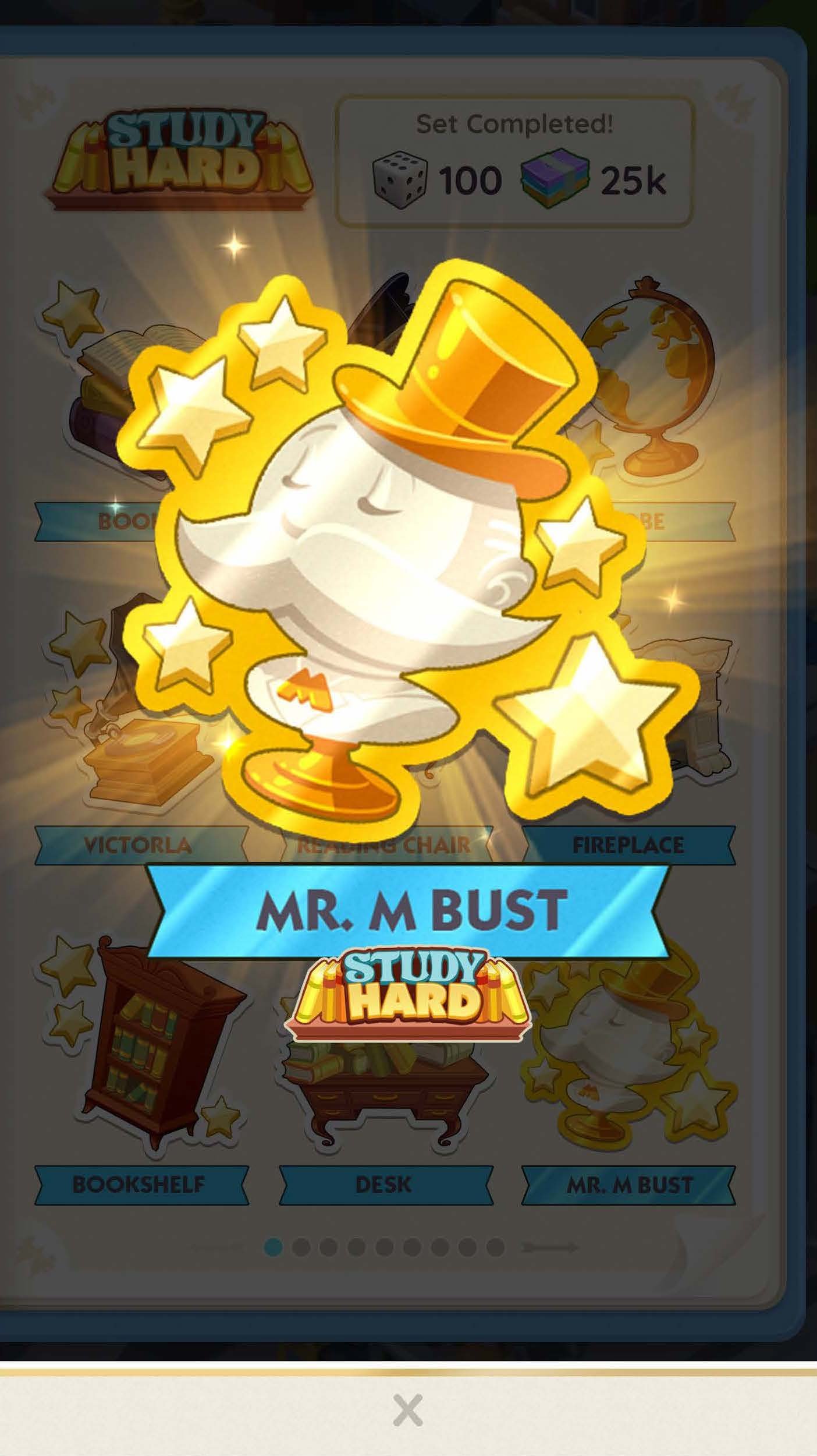
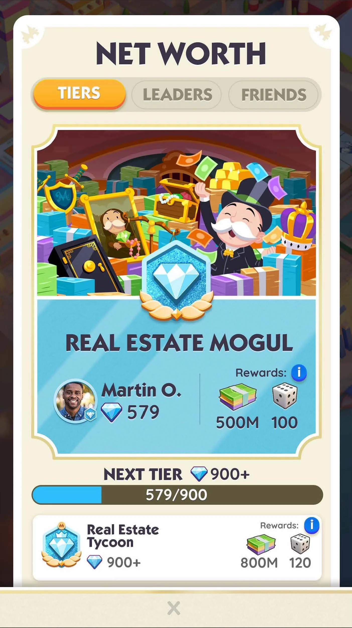
3 examples of how we improved the look and feel of the UI by bringing in a “game card” feeling to the UI, leveraging the classic and nostaligic board game IP, in a minimal way. Each of these moments lent themselves to having the card layer obfuscate the game board and let the player analyze the card and make game decisions based on the information. Even in less obvious moments like menus, we were able to leverage this strategy to better tie in even the most administrative player tasks and make them more delightful with nostalgia.
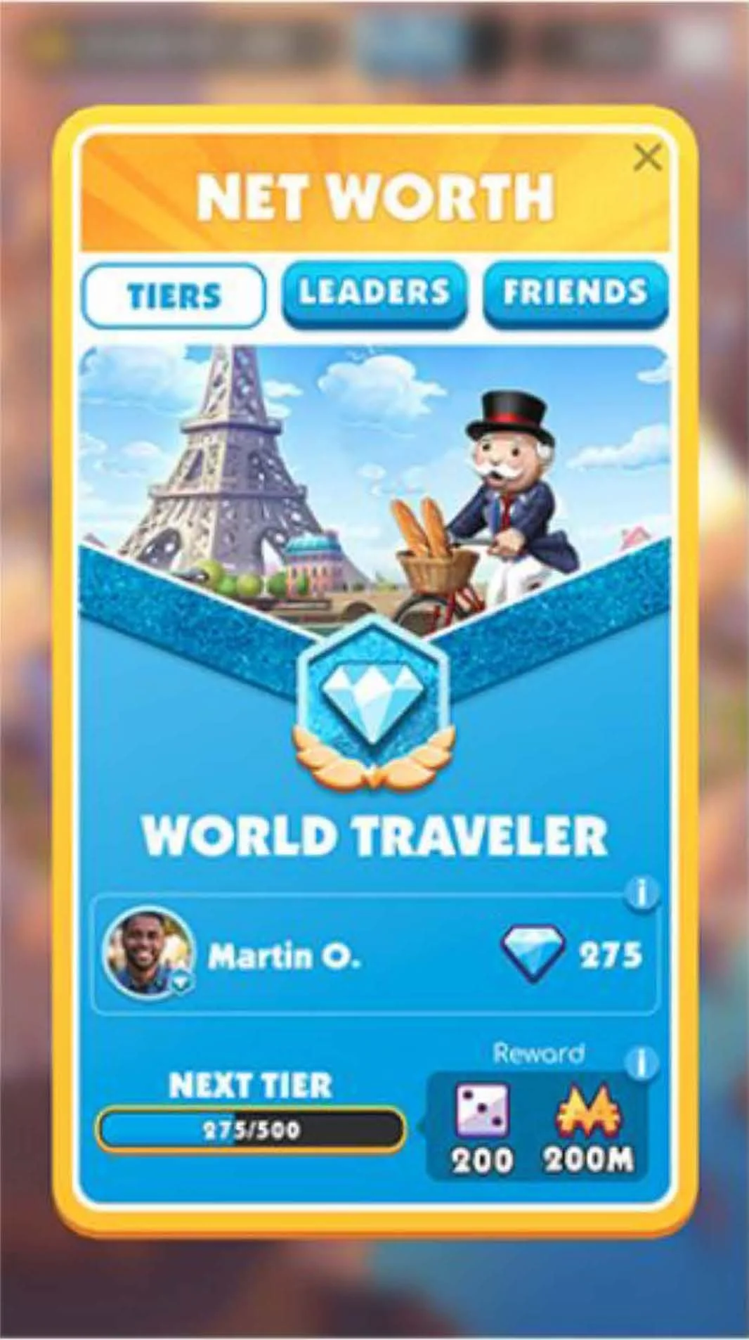
Networth (Leadboard)
Chance
Before
After
Additional updated screens